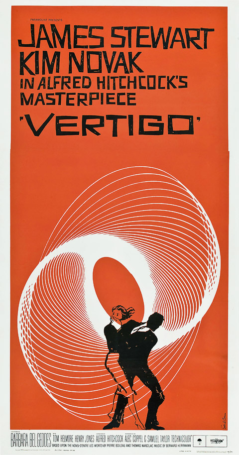
Friday, April 27, 2012

Saul Bass


Saul Bass

Saul Bass who was born in 1920, was not only one of the great graphic designers of the mid-20th century but the undisputed leading of film title design thanks to his collaborations with Alfred Hitchcock, Otto Preminger and Martin Scorsese. After apprenticeships with Manhattan design firms, Bass worked as a freelance graphic designer or a commercial artist as they were called. Chafing at the creative constraints enforced on him in New York, he moved to Los Angeles in 1946. After freelancing, he opened his own studio in 1950 working mostly in advertising until Preminger invited him to design the poster for his 1954 movie, Carmen Jones. Saul Bass's work touches people, not just designers, or students, or spectators of design, or those who know and can explain what a designer is and does, but simply people many people.  

He left New York for Hollywood in the mid-1940s to find a way to combine his restless and imagination and a few years of New York experience working in graphic design, into a career. Before anyone in the film industry, Bass recognized the importance of a movie's first moments. Saul Bass and his firm have created a fair measure of what we now observe as the modern business and commercial world.

Saul Bass available at: http://www.saul-bass.com/


Paul Rand


Paul Rand

Paul Rand born in August 15, 1916 was a well-known American graphic designer that is best identified for his corporate logo designs. Rand's education involved the Pratt Institute, the Parsons School of Design, and the Art Students League. He was one of the originators of the Swiss Style of graphic design. From 1956 to 1969 and beginning again in 1974, he taught design at Yale University in New Haven, Connecticut, as well as being inducted into the New York Art Directors Club Hall of Fame in 1972. He designed numerous posters and corporate identities containing the logos for IBM and ABC. By the time that Paul started working out of his Weston studio he was well known as a designer of trademarks.

He had completed designs for some companies including Esquire, Coronet Brandy, and Robeson Cutlery, the destinies that continued as casual roles in directing the Rand talent toward critical areas of design started to set the stage for his third major design career corporate identity. Thomas J. Watson, Jr., had come recently to the presidency of the International Business Machines Corporation, and his search for a graphic designer to create the corporate image led to Paul Rand.


Babra Kruger


Barbara Kruger

American conceptual/pop artist Barbara Kruger was born in Newark in 1945. Early on she established an interest in graphic design. She studied with fellow artists/photographers Diane Arbus and Marvin Israel, who presented Kruger to other photographers and fashion/magazine sub-cultures. Not long after she started to work at Mademoiselle magazine as an entry-level designer. Further on she worked as a graphic designer, art director, and image editor in the art departments at House and Garden, Aperture, and did magazine layouts, book jacket designs. 
Her period of background in design is marked in the work for which she is now renowned.

Kruger was influenced by her years working as a graphic designer. In recent years Barbara Kruger has extended her aesthetic project, creating public installations of her work in galleries, museums, municipal buildings, train stations, and parks, as well as on buses and billboards around the world. Walls, floors, and ceilings are covered with images and texts. Since the late 1990s, Kruger has incorporated sculpture into her on going critique of modern American culture. Much of her work engages of found photographs from present sources with aggressive text as well her imagery and text including criticism of sexism and circulation of power within cultures.


Franklin McMahon


Franklin McMahon
Franklin McMahon born on September 1921 was an artist reporter, that his work took him around the world for more than half a century. His work incorporated on journalism preferences for photographs to make a renowned career of drawing historic scenes in beauty, as well as emphatic lines. He sold a cartoon to Collier’s magazine while he was still in high school, after working for Life at the Till trial, McMahon a freelance artist, covered almost every national political convention from 1960 to 2004. After working for Life at the Till trial, McMahon a freelance artist, covered virtually every national political convention from 1960 to 2004, the Selma-to-Montgomery civil rights march, the Nixon-Kennedy debates and the Second Vatican Council.
He made a number of films consuming his pictures, and the presenting of one, about Chicago at Christmas, became a tradition in the city. Life magazine hired McMahon to make courtroom sketches of the trial, held in Sumner, assuming most on what you would think he was a print reporter doodling. He later redrew the sketches in his hotel room, and again in his studio. One of the most celebrated of the trial sketches published in Life captured Mose Wright, Emmett’s uncle.


Alan Kitching


Alan Kitching­
Alan Kitching Born in Darlington in 1940, is a graphic designer, typographer, letterpress printmaker and teacher. Alan Kitching is best known for his expressive use of letterpress type, process and materials in creating typographic designs for publishing, advertising and his own limited edition prints. Alan found his own design practice, he taught at the Central School of Art, and was invited by Derek Birdsall to join the Omnific Design Partnership. He became visiting lecturer in typography at the Royal College of Art in 1988 and established his workshops there for students of all disciplines. In 1989 Kitching decided to go back to his letterpress roots and launched The Typography Workshop in Clerkenwell London with the first of his A1 ‘Broadside’ sheets an occasional publication devoted to the typographic arts’.
As well as compositions for corporate identities, magazine and book covers and illustration. Alan’s work has also included; postage stamps, theatre posters, shop windows, billboards, signage and a typographic mural for the Guardian Newspaper’s London office. Kitching did not have a style in his work, he had his own style taking every opportunity. In terms of his work that consisted on letter pressing works out as a nice effect in terms of texture of the text and the layout which appears at angles with some letters overlapping each other as well as visual shapes merging in.


(accessed on 28th April)


Willis O'Brien


Willis O’Brien

Willis O’Brien was an excessive artist pioneer of American stop motion, who was born in California in 1886. O’Brien held a number of jobs and hobbies during his developmental years. His careers that consisted of serving as a guide to studying the forms of life in Creater Lake region as well as being a sculptor and illustrator. One day, while constructing models with his colleague O’Brien thought idea that he recognized that he could animate the prototypes on the same techniques that cartoonists used to animate drawings by constructing a prototype then moving its part frame by frame at a time to create the illusion of movement, he could give the prototypes a cinematic life. Through this method of stop motion animation had been invented and used already.

On the day he got back the first printed footage of King Kong 1933 in motion he noticed that the fur covering the puppet moved because it was disturbed by his fingers during filming. In my opinion, Willis O’ Briens work stands out great in terms of usage of techniques and movement which takes a lot of time moving a figure frame by frame, it’s also interesting the way the figures move to give it an illusion of movement.


Willis O’Brien, available at: http://www.imdb.com/name/nm0639891/bio
(accessed on 26th April)


Charles Bowers


Charles Bowers

Charles Bowers was an American who was born on 7th June 1877 and was a cartoonist and a slaptstick comedian. His life led an astonishing life earlier to getting involved to motion pictures, He did all types of work over the years containing circus jobs, theatrical work, bronco busting and cartooning. Bowers was a talented cartoonist, and used his skills in a extremely creative mind to get into the animation fields. In 1926 he started to give serious thought to live action filmmaking and he also created a photographic method by using a camera by which he could achieve truly amazing stop motion based special effects, joining them into a non animated context. In terms of his work, it was completely silent, his films showed an exceptional filmmaker who varied animation with the purest form of slaptick, where imagination transmuted ordinary features of everyday life into fantastic scenes using the creative method of surrealism.

In terms of his work, in my opinion his work has a sense of visual and a creative style verified by his work and how it was constructed together. The animation works out good in terms of movement of frame by frame, and also makes you think imaginative relating it to slapstick animation.

Charles Bowers, available at: http://www.imdb.com/name/nm0101038/bio